1.1.0 | UI/UX Overhaul!
A new look!
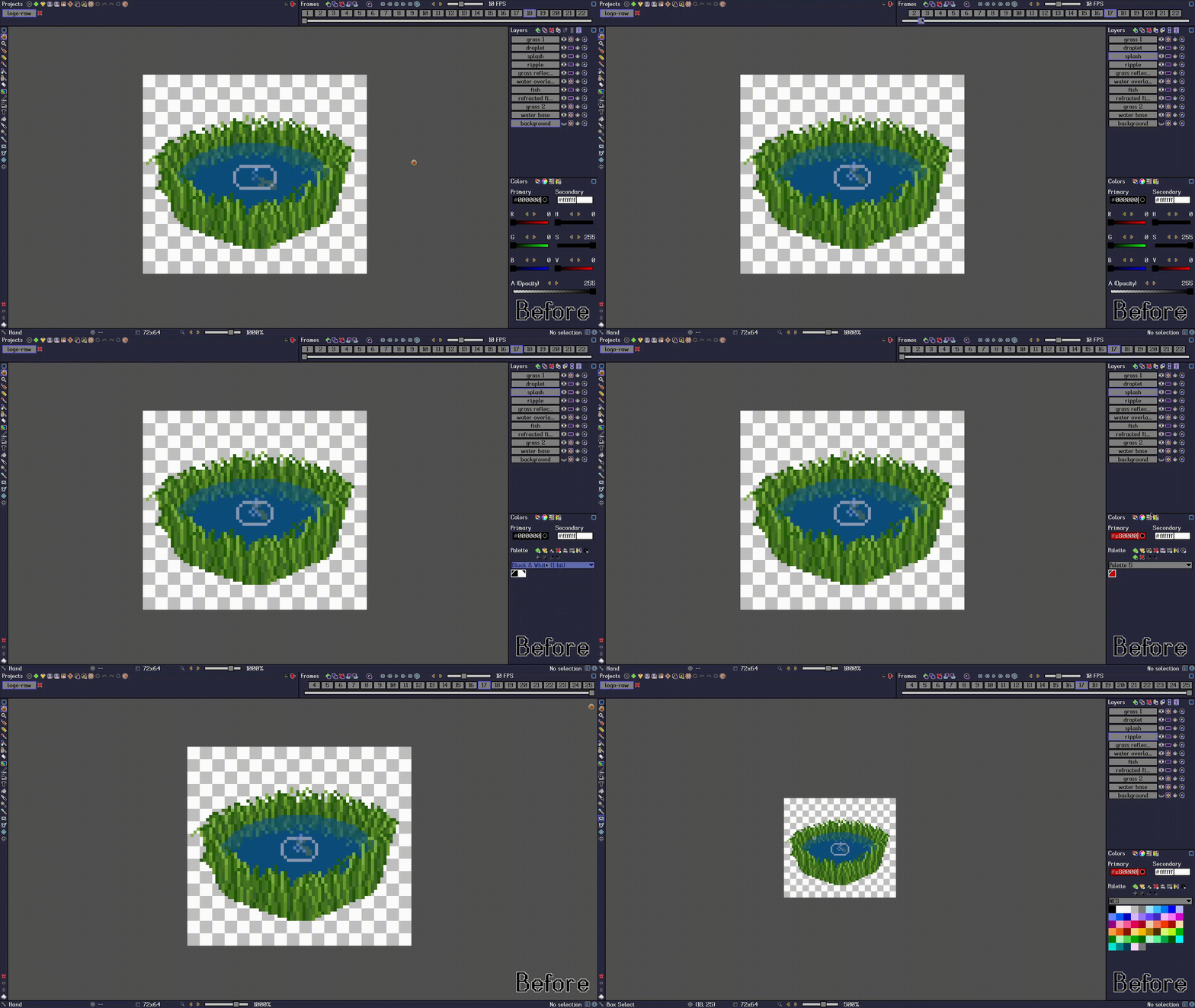
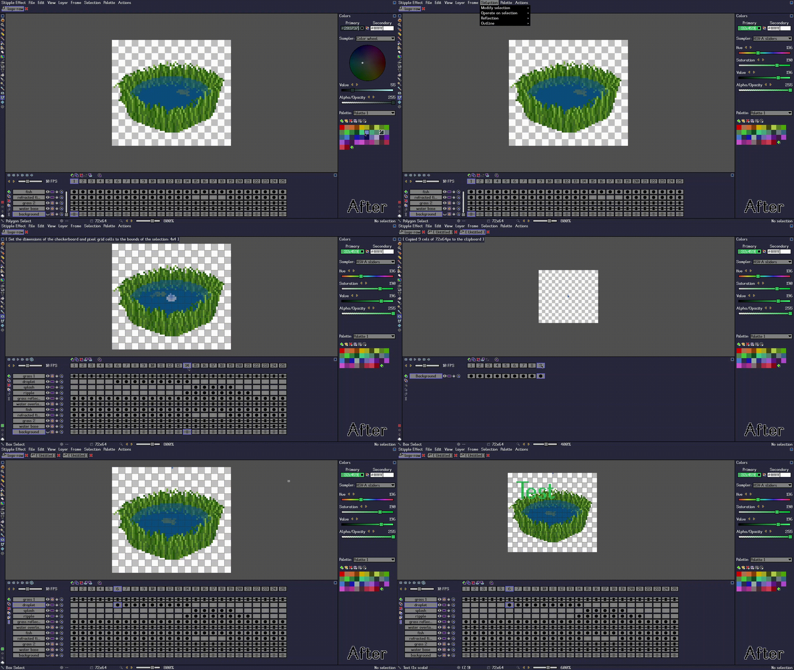
1.1.0 introduces an updated visual identity for Stipple Effect. Here is an overview of what has changed:
Before
After
My goals
Overall decluttering
Prior to this update, there were about a hundred icons on display in the window at any given time. Many of these icons were not self-explanatory and the user could very easily be overstimulated. Most of these icons were stripped out and redesigned into a navbar, which also has menu items for program actions that were previously only executable via a keyboard shortcut.
Build user intuition
It will be easier to learn to keyboard shortcuts associated with an action by seeing them alongside the action in the navbar than having to hover over an icon and have the tool tip eventually display the shortcut.
Unify the Frames and Layers panels
Beyond reducing the number of UI panels onscreen, unifying these panels allows me to visualize animation cels better and allows the user to operate on cels.
Add functionality
- Draggable buttons: frames, layers, and palette colors can now be dragged and resorted
- Range of cels across multiple layers and frames can now be selected, copied, cut, pasted, and deleted
Extend the Colors panel
The removal of the Layers panel allows for the Colors panel to take up almost the entire height of the window. This way, the color sampler and the palette can be displayed simultaneously without having to toggle between the two views.
Changelog
For the full changelog, please refer to the GitHub release.
Files
Get Stipple Effect
Stipple Effect
A scriptable pixel art editor to make game assets faster!
| Status | Released |
| Category | Tool |
| Author | Jordan Bunke |
| Tags | 2D, Animation, Characters, Icons, image-editor, Pixel Art, PNG, script, software, Sprites |
| Languages | English |
| Accessibility | High-contrast |
More posts
- Stipple Effect v1.2.3 out now!Jan 30, 2025
- 1.2.2 + new website!Dec 31, 2024
- 1.2.1 available now + demo buildsSep 06, 2024
- Updated demo to v1.2.0Sep 04, 2024
- 1.2.0 | Major improvements and additions to scripting, preview window, and onion...Sep 03, 2024
- Demo available for download!Jul 11, 2024
- v1.0.1 is out now!Jul 11, 2024
- VS Code syntax highlighting extension for Stipple Effect scriptsJun 27, 2024
- 1.0.0 | Official Release!Jun 13, 2024


Leave a comment
Log in with itch.io to leave a comment.